Best Colors for a Cozy Winter Living Room
By Decorguider Editorial — This guide is edited for paint undertones, room light, and finish coordination. For color planning, it follows standard interior-design guidance on undertones, north-facing light, and layered lighting rather than trend-only color names.
For a cozy winter living room, choose one warm neutral base, one mid-tone accent, and one deep grounding color; if the room gets little winter light, keep the darkest color to a small supporting role rather than letting it dominate the palette. Poor color choices can make the room feel colder, flatter, or accidentally holiday-themed. This guide shows how to match wall color, textiles, and accents to light, room size, and existing finishes.
Winter daylight is cooler and less direct, especially in north-facing rooms, so warm undertones usually read better than icy ones; see Benjamin Moore’s guidance on colors for north-facing rooms and Sherwin-Williams’ advice on choosing colors by light exposure in How to Choose Paint Colors. For evening use, layered ambient, task, and accent lighting helps winter colors hold their warmth; see the U.S. Department of Energy’s lighting guidance and the National Association of the Remodeling Industry’s lighting overview.
Choosing warm neutrals and matching undertones



A cozy winter room starts with the light in the space and the finishes already in it. Choose wall color first, then large furniture, then accents, because each choice carries a different risk level. Undertones matter more than the color name on the paint chip. If you want a broader framework, see how to make a living room feel warmer in winter.
Warm neutrals are the safest base for most living rooms because they sit comfortably beside wood, woven pieces, and layered fabrics. Cream, beige, taupe, warm gray, and soft almond often work well on walls or large upholstery, especially when the room already has wood, woven pieces, or textured textiles.
Choose wall color, then furniture, then accents
Walls set the overall temperature of the room. Large furniture, such as a sofa or curtains, should reinforce that temperature, not fight it. Accents are where you can be braver with cranberry, mustard, coral, or gold.
If the room already has a strong finish, let that finish lead. A dark wood floor can take a warmer wall color. White trim usually looks better with a soft, not icy, wall shade so the trim does not feel harsh.
Use undertones to keep the palette from clashing
Warm neutrals need warm companions. Look for beige with a yellow or brown cast, taupe with a soft mushroom note, or warm gray that reads more stone than blue. These pair well with oak, walnut, rattan, linen, and wool.
Cool shades can still work in winter, but they need help. Blue, lavender, and gray look better when you repeat a brown wood tone nearby or keep them in textiles rather than on every surface.
Warm neutrals for the base
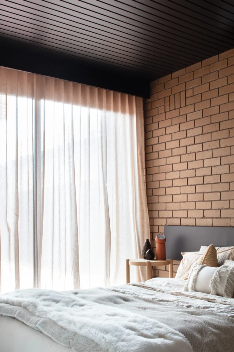
Warm neutrals are the easiest way to make a winter room feel inviting without making it dark. Cream, beige, taupe, warm gray, and soft almond work as wall colors or large base pieces because they give the room a soft backdrop and leave room for texture. They also pair cleanly with wood and textured textiles.
Where warm neutrals work best on walls and large pieces
If you are painting, start with the walls or the main upholstered piece, not both at once. A cream wall with a beige sofa can work if one is clearly lighter and the other is slightly deeper. The room reads flat when both finishes sit at the exact same value.
Soft almond and warm gray are useful when you want a quieter look than bright cream. They bridge older wood furniture, woven rugs, and neutral curtains without pushing the room into a cool, gray cast.
How wood and textile texture keep neutrals from feeling flat
Neutral color needs texture to carry it. Wool, faux fur, velvet, chunky knit, and linen add enough surface variation to keep a cream or taupe room from looking blank. A single smooth sofa in a pale shade can feel thin; the same sofa with a knit throw and a nubby pillow reads warmer.
Natural materials help too. Wood, rattan, ceramics, plants, and branches interrupt an all-soft palette and stop it from feeling washed out. In winter, that mix matters as much as the paint itself.
Winter living room color decision table

This table is built for real room conditions: size, daylight, trim, and floor finish. Use it before you buy paint, curtains, or pillows. It keeps the palette tied to the room you already have and makes failure cases easier to spot early.
| Room condition | Recommended wall color family | Best accent family | Do-not-use warning |
|---|---|---|---|
| Small room with limited winter daylight | Warm cream, soft almond, or light beige with yellow-brown undertones | Gold, camel, or muted cranberry in pillows and a throw | Do not use a charcoal wall, dark sofa, and dark rug together; the room can lose its edges and feel smaller. |
| North-facing room with white trim and pale floor | Warm beige or taupe with a beige, mushroom, or caramel undertone | Forest green, navy, or rust in small doses | Do not choose an icy blue wall color; north light can make it read gray and cold. |
| North-facing room with dark wood floor | Soft cream or warm gray that is lighter than the floor by several values | Walnut-brown leather, camel, or deep evergreen | Do not pair espresso floors with a cool gray wall and silver accessories; the room can feel flat and heavy. |
| Large room with lots of winter sun | Mid-tone taupe, greige, or muted olive-beige | Cranberry, mustard, or navy in textiles and one chair | Do not use all pale neutrals; in bright winter sun the room can start to feel washed out rather than cozy. |
| White trim, medium-tone floor, mixed wood furniture | Warm gray or beige with a soft stone or clay undertone | Rust, brass, and textured cream | Do not use a blue-white trim color with a cool wall; the trim can look stark while the walls look dull. |
| Room with a strong cool rug already installed | Warm neutral wall color that softens the rug’s blue or gray cast | Walnut, linen, and camel to bridge the cool tone | Do not add another cool wall color on top of the rug; the room can tip from wintry to chilly. |
A common first-timer mistake is picking a pretty wall color and ignoring the floor. Suppose a room has espresso wood flooring and a north-facing window. A cool gray wall with a blue sofa can make the space feel colder than the same room with taupe walls and a navy throw. If you want more examples, browse cozy winter living room ideas.
Should you choose dark or light colors?
Choose darker colors when you want a cocooning effect and the room has enough daylight to support it. Choose lighter base colors when the room already feels dim or the floor is dark. The goal is warmth, not a cave effect.
When deep winter tones add a cocooning effect
Deep winter tones such as forest green, charcoal gray, navy, and evergreen work best on a single wall, an upholstered chair, or a blanket. They create depth without taking over the whole room. Chosen Furniture includes “Charcoal Grey + Metallic Silver” and “Evergreen Forest + Gold Accents” among its winter living room palette ideas.
These shades suit rooms that already have some brightness from windows, mirrors, or pale trim. They feel grounded when balanced with a warm neutral nearby.
When lighter base colors keep the room open
In a low-light room, a cream or beige base is safer than a deep wall color. Chosen Furniture also lists “Cream + Warm Walnut Wood,” which shows why warm wood matters when the room needs softness rather than more visual weight. Light walls let textiles and accents do the seasonal work.
Use deeper colors in one or two places only: a pillow group, a throw, or a single accent chair. That gives the room contrast without swallowing the light.
How to balance depth with lamps and reflective finishes
Lighting changes how winter color reads after dark. Layered ambient and task lighting helps a room keep its warmth once daylight drops, which is why the U.S. Department of Energy recommends planning indoor lighting for function as well as comfort. Use at least two light sources in the living room so dark accents do not turn the room muddy in the evening.
Reflective finishes can help, but keep them subtle. A glazed ceramic lamp, a metal tray, or a mirrored frame can bounce light without making the room feel shiny.
How do you mix warm and cool shades?
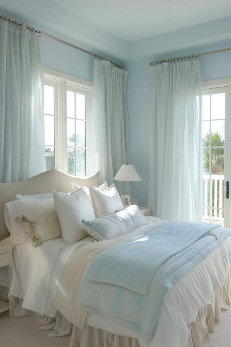
Mixing warm and cool shades works when the cool color is not left alone. Icy blue, dusty lavender, frosty blue, and soft gray can feel wintery without feeling cold if you warm them with brown wood, walnut, oak, or cream around them. Keep the cool tone as the note, not the whole song.
Muted cool colors that work in winter
Chosen Furniture includes “Icy Blue Hues + Crisp White” and “Dusty Lavender + Soft Grey” in its winter palette list. Those combinations can work, but they need a warm counterbalance in the same room. A blue cushion against a walnut coffee table is easier to live with than a blue wall beside blue curtains.
Molly in Maine recommends pairing blue with warm caramel browns for winter coziness. That advice fits the whole room, not just one corner.
How to warm icy blue, dusty lavender, and soft gray with wood
Use wood as the bridge between the cool shade and the rest of the room. Oak floors, walnut side tables, rattan baskets, and wooden picture frames give the eye a warm landing point. If the room already has dark wood, choose a softer version of the cool color so the space does not feel heavy.
Textiles matter here too. Linen curtains, a wool throw, or a chunky knit pillow can keep a cool palette from feeling stark.
Where to keep cool tones so the room stays inviting
Keep cool colors on easy-swap pieces first. Curtains, pillows, blankets, and rugs are lower-risk than paint or a sofa. A cool rug can work if the sofa is warm and the walls are neutral.
Save the strongest cool shades for one focal point. That could be one armchair, one throw, or a pair of cushions. The room stays balanced when the cool color does not repeat everywhere.
Best accent colors for winter
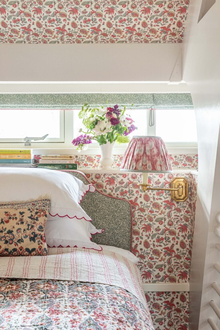
Warm accent colors add life without turning the room into holiday décor. Cranberry, mustard, coral, and gold work best in small amounts, especially on pillows, throws, candles, trays, or a single decorative object. Chosen Furniture includes “Cranberry Pop + Snow White” among its winter ideas, but that kind of contrast works best when the cranberry stays limited.
Pillows, throws, curtains, and rugs as easy swap points
Textiles are the easiest place to change the mood. Throw pillows, blankets, curtains, rugs, and even one upholstery piece can shift the room toward winter without repainting. Add one warm accent family and repeat it two or three times, not ten.
If the room already has a neutral sofa, use the accent in a pillow, a folded throw, and one small object on the coffee table. That is enough to read intentional.
How to avoid a holiday-only look
Skip bright red-and-green pairing unless that is the exact look you want. Cranberry is easier to live with than pure red, and gold reads warmer than shiny silver. When you mix warm accents with deep green or navy, keep the holiday reference abstract, not literal.
Natural elements help here too. Branches, wood bowls, ceramic vases, and a few plants make the palette feel seasonal without leaning into ornament territory.
How do you add texture and light?
Texture and light keep winter color from looking flat. Use wool, faux fur, velvet, chunky knit, and linen to break up large color fields. Then add lamps, candles, and soft decorative lighting so the room feels warmer after dark, not just during the day.
Use texture to stop flat color
A room in cream and beige can still feel cold if every surface is smooth. Put a velvet cushion beside a linen one. Add a chunky knit throw over a sofa. Use a wool rug if the floor feels hard under the room’s palette.
Homes & Gardens recommends “layered design,” and Bless’er House points to a “warm, cozy, colorful space” with “warm, heavy textiles.” That combination matters because texture gives neutral color depth.
Build warmth with layered light sources
Use at least one table lamp, one secondary light source, and one soft decorative element such as candles or fairy lights. Homes & Gardens specifically emphasizes “cozy lamps, fairy lights and candles” for winter lighting. Multiple sources reduce the blue cast that often shows up after sunset.
Place light near the seating zone, not just at the room edges. That keeps the seating area feeling warm and readable.
Use natural materials as visual anchors
Wood, rattan, ceramics, plants, and branches are useful when the color palette leans cool. They add temperature and texture without adding clutter. If a blue or gray room feels too sharp, a wooden tray or rattan basket can soften the read fast.
Checklist for a cozy winter living room
Use this checklist after you narrow the palette. It keeps the room from drifting into a color combination that looks good on a chip but fails at home.
- Check the room’s natural light and decide whether the walls should be warm neutral or a deeper winter tone.
- Match the wall color to the room’s existing floor and trim, not to a photo you saved online.
- Choose one accent family for pillows, throws, or a rug, then repeat it no more than three times.
- Add at least two texture types, such as wool and linen, or velvet and chunky knit.
- Test the undertone beside the rug, floor, and trim in daylight and after dark before you commit.
Undertone checks matter most in winter because daylight and evening light can produce different readings. Swatches that look warm at noon can look cooler at dusk, especially beside white trim, gray tile, or a blue rug. That is why paint brands and design guides recommend viewing samples in the actual room before finalizing a color.
Picture a living room with white trim, a tan sofa, and a gray rug. A soft taupe wall and gold pillows will usually feel warmer and steadier than a cool gray wall with silver accents. The second version can look tidy in daylight but colder at night. If you are comparing options, save the strongest ideas to cozy winter living room ideas and match them back to your own light conditions.
Frequently asked questions
What colors make a living room feel cozy in winter?
Warm neutrals such as cream, beige, taupe, warm gray, and soft almond are the most reliable cozy winter base colors. Add depth with forest green, navy, charcoal gray, or evergreen in smaller doses. Finish with cranberry, mustard, coral, or gold as accents, not the main event.
How do I make my living room warmer with color?
Start with a warm wall or sofa color, then add wood, linen, wool, and a deeper accent shade. The easiest warmth comes from beige, taupe, or cream paired with walnut, oak, or rattan. Keep cool shades limited to one or two textiles so they do not cool the whole room.
Should I use dark or light colors for a cozy winter living room?
Use darker colors when the room has enough daylight and you want a cocooning effect. Use lighter warm neutrals when the room is small, north-facing, or already dark. Deep colors work best on one wall or in textiles; light colors are safer for the main surfaces.
What are the best cozy paint colors for a living room?
Look first at warm neutrals: cream, beige, taupe, warm gray, and soft almond. They are the safest winter wall colors because they pair well with wood and textured textiles. If you want more depth, try forest green or navy on one feature wall, not every wall.
How do I combine warm and cool colors in a winter living room?
Use a warm base, then bring in one cool shade through a rug, cushion, or chair. Warm the cool color with walnut, oak, or caramel-brown details nearby. This keeps icy blue, dusty lavender, or soft gray from reading cold and keeps the room balanced.
How do I decorate for cozy winter without using only red and green?
Use cranberry, mustard, coral, and gold instead of a straight red-and-green scheme. Pair those accents with cream walls, wood furniture, wool throws, and soft lighting. That gives the room a winter feel without making it read as holiday-only décor.
Products related to this article
Sponsored / affiliate links. As an Amazon Associate I earn from qualifying purchases. I may earn additional commission from eligible campaigns.