Bedroom Color Scheme Problems: How to Fix Them
Bedroom color scheme problems usually come down to one variable: lightness, temperature, or contrast. Change one, then check the room again in daylight and lamplight. If the mismatch stays, the room may need a paint change, but start with the smallest fix first.
Bedroom color troubleshooting matrix



This table gives you the fastest route from symptom to fix. Start with the visible problem, check the likely cause, make the smallest change first, and repaint only if the room still reads wrong after those adjustments.
| Symptom | Likely cause | Quick fix | Repaint threshold |
|---|---|---|---|
| Too dark | Low light, dark walls, or too much matte finish in a small room | Swap to higher-output bulbs, add a light rug or bedding, and increase contrast with white or cream | Repaint if the room still feels cave-like after lighting and textiles change |
| Too cold | North-facing light, cool bulbs, gray-heavy palette, or chrome-heavy decor | Use warmer bulbs, cream bedding, brass accents, and natural wood | Repaint if the wall color still reads icy in daylight and lamp light |
| Too pink | Blush walls, warm bulbs, or beige fabrics pulling the hue rosy | Balance with greige, muted white, or matte black hardware | Repaint if the pink cast stays obvious after removing warm accessories |
| Too gray | Cool paint, north-facing light, or too many gray fabrics | Add warm wood, cream textiles, and a warmer bulb temperature | Repaint if the room still feels flat and drained |
| Too busy | Too many colors, mixed finishes, or clashing undertones | Cut the palette to three colors, four maximum, and repeat the main finish | Repaint if you cannot reduce the visual clutter with accessories alone |
| Too washed out | Low contrast between walls, bedding, and furniture | Add darker anchors, such as walnut, navy, or charcoal accents | Repaint if the room still lacks structure after stronger contrast |
| Too muddy | Competing undertones from wall paint, rug, and upholstery | Pull out one off-note color and replace it with a cleaner neutral | Repaint if the main wall color turns dull in both daylight and lamp light |
| Too harsh | Bright white walls, cool bulbs, or black accents with little softness | Add warm textiles, a cream shade, and wood grain | Repaint if the brightness still feels stark after softening the room |
| Too flat | All surfaces sit in the same middle tone | Introduce one darker anchor and one lighter counterpoint | Repaint if the palette still has no clear dominant, secondary, and accent role |
| Too saturated | Several strong colors compete for attention | Keep one strong color and mute the rest | Repaint if the room still feels loud after accessories are simplified |
| Color shifts by wall | Mixed-light bedroom with opposite exposures or different lamp zones | Test paint on two walls, one in each main light path, and standardize bulbs before changing paint | Repaint if the same color still clashes across the room |
| Looks fine by day, wrong at night | Daylight and lamp light are pulling the color in opposite directions | Choose bulbs that flatter the wall color and bedding together, then check the room at night | Repaint if the night read stays off after bulb changes |
Why does my bedroom paint look different at night?
Bedroom paint looks different at night because lamp light changes the color you see. It can warm a wall, flatten it, or drain it. A room may read one way in daylight and another after dark, so bulbs often need attention before paint does.
Daylight versus lamp light
Daylight shows a paint color more clearly, while artificial light can push it warmer or cooler. East-facing rooms get bright morning light that fades to cooler tones by evening. West-facing rooms do the reverse, so the same wall may look crisp at breakfast and heavy after dinner.
North-facing rooms get cooler, indirect light that can make colors look muted and gray. South-facing rooms get warm, steady light that can make color read stronger. If the bedroom changes too much from day to night, the paint may be acceptable and the lighting may be the real issue.
How bulb color shifts paint
Bulb color matters because bedtime lighting changes what your eye picks up. A warm bulb can make beige lean peachier, make blush read stronger, or make gray look muddier. A cooler bulb can reduce warmth in cream, sand, and terracotta and may make the room feel less settled.
Start with one bulb change before repainting. If the walls only look wrong under the lamp, the paint may be fine and the fixture may be the mismatch.
What to change before repainting
- Check the room under daylight, afternoon light, and nighttime lamp light.
- Replace any bulb that pushes the room too warm or too cool.
- Bring in bedding or a rug that repeats the main wall undertone.
- Test paint on two walls, one in each main light path.
- Repaint only if the color still reads wrong after those changes.
Say your west-facing bedroom looks soft in the morning but yellow and flat at night. A warmer bulb may make the walls feel even more golden. A neutral bulb, cream bedding, and a brass lamp base often solve that faster than new paint.
What color problem are you seeing?
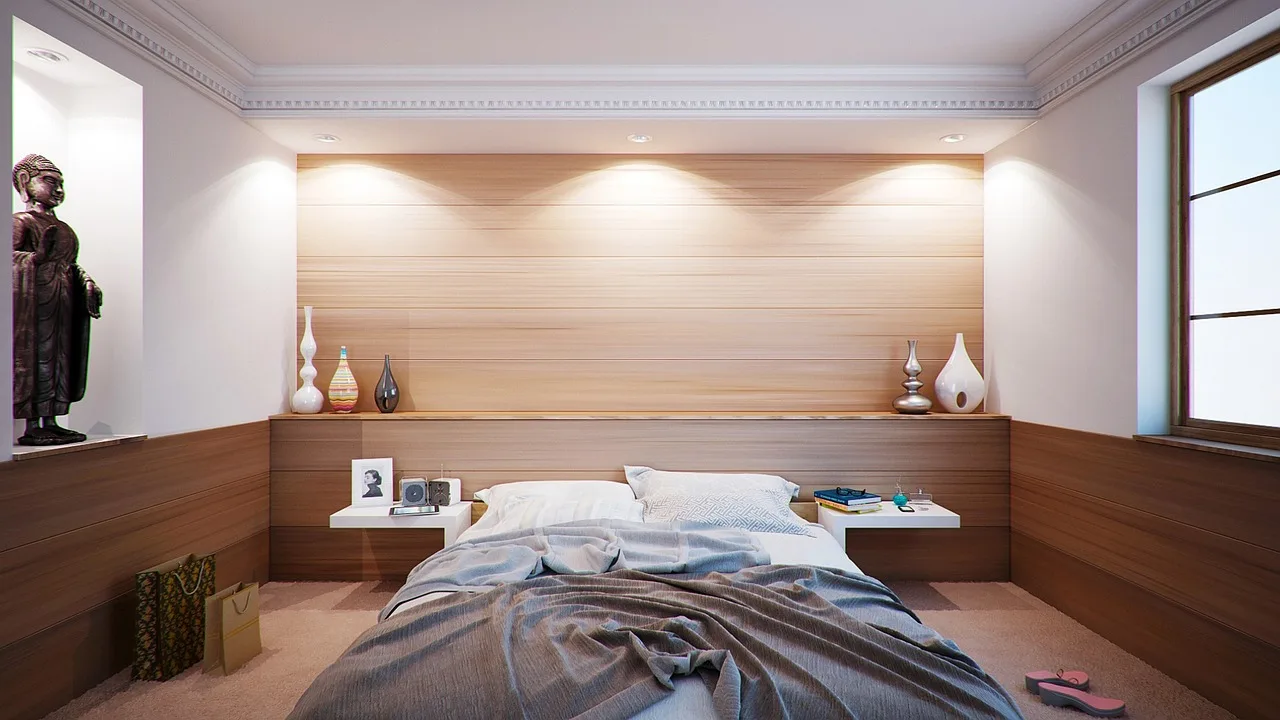
Start with the symptom, not the color family. A bedroom that feels too dark needs more reflection and less visual weight. A room that feels too cold needs warmth. A room that feels too busy needs fewer competing colors and finishes.
Too dark
Dark colors absorb light and make small rooms feel smaller. If the bedroom is compact, low-ceilinged, or already shaded, the fastest fix is usually lighter textiles, a lighter rug, and a stronger lamp rather than repainting right away.
If the room still feels heavy after those changes, move toward warm neutrals such as warm white, cream, oatmeal, sand, or linen. Those shades work in any light condition and with any furniture style.
Too cold
Cold rooms usually come from north-facing light, cool bulbs, gray-heavy walls, or metal finishes that lean icy. Warm it up with walnut, brass, cream bedding, and a warmer light source. Avoid piling on more gray, because that often makes the problem worse.
Too pink
Too much pink often appears when blush walls meet warm bulbs, pale woods, or beige fabrics with a rosy undertone. Ground the color with greige, dusty rose only in small amounts, and hardware in brass or matte black. Chrome often makes the room feel more clinical.
Too gray
A gray bedroom looks cold or flat when the paint leans blue, the light is indirect, or every textile stays in the same muted range. Add cream, warm wood, and a little contrast. If the paint still looks lifeless, the wall color may be too cool for the room’s light.
Too busy
Busy rooms usually have too many colors or too many finishes fighting each other. The cleanest fix is to cut back to three colors, four maximum. Use one dominant shade, one secondary shade, and one accent, then repeat the same metal finish instead of mixing several.
Too washed out
Washed-out rooms often lack contrast between the wall color, bedding, and furniture. Add one stronger anchor, such as walnut, brass, navy, or charcoal, so the eye can find a clear shape. If everything remains pale, the room can feel unfinished rather than calm.
How room size and light direction change the fix
Room size and exposure change how every color reads. Light colors reflect light and can help small rooms feel less compressed, while dark colors absorb light and reduce perceived spaciousness. The right fix depends on both wall color and the direction of natural light.
North-facing bedrooms
North-facing rooms get cooler, indirect light, so colors often look muted and gray. Warm neutrals are the safest choice here, especially warm white or cream walls with walnut wood and brass hardware. If you want color, keep it warm and avoid gray-heavy combinations.
South-facing bedrooms
South-facing rooms have warm, steady light that intensifies color. That makes them good candidates for deeper color and clearer contrast. Deep blue bedrooms work best with decent natural light, plus white or cream bedding, brass lamps, and natural wood.
East-facing bedrooms
East-facing spaces can feel bright and cheerful in the morning, then cooler and flatter by evening. Choose a palette that stays steady under both conditions. Warm neutrals, sage with warm wood, or blush balanced with greige usually hold up better than a very cool gray.
West-facing bedrooms
West-facing rooms often do the reverse, cooler earlier in the day and warmer later. That can make a paint sample feel inconsistent unless you test it on two walls. If the evening glow pushes the room too orange, reduce warm accessories and keep bedding closer to cream or white.
Small rooms and perceived spaciousness
In small rooms, the fix is often about reducing visual weight. Light colors reflect more light, so they can make a room feel less compressed. If you want a darker palette in a small room, keep the contrast controlled and use light bedding or trim to stop the walls from closing in.
What colors work best in a small bedroom?
Small bedrooms usually do best with light, calm colors that reflect light and keep the eye moving. Warm white, cream, oatmeal, sand, and linen are often used as good starting points. If you want a darker wall color, keep the rest of the room light enough to preserve openness.
Light colors and reflective surfaces
Light walls, a lighter ceiling, and reflective accents help a compact bedroom feel more open. That does not mean everything must be white. Cream bedding, a pale rug, and a walnut nightstand can still add warmth without making the room feel boxed in.
When dark colors still work
Dark colors can still work in a small room when the palette is controlled and the lighting is thoughtful. A moody dark palette can use charcoal, deep forest green, or dark plum, especially if you carry the same color onto the ceiling and add warm textiles. That treatment works best when the room is not starved for light.
Keeping contrast under control
Too much contrast can make a small room feel chopped up. Stick to a limited palette and repeat the same undertone in the walls, bedding, and floor covering. If the room already has a strong wall color, let the bedding and curtains soften it instead of competing with it.
How do you repair a palette without repainting everything?
Repair the room in layers. Start with bulbs, then bedding, then curtains and rugs, then hardware and wood tone. Repaint only when the wall color still reads wrong after those lower-cost adjustments. That sequence usually saves time and avoids fixing the wrong problem.
Adjust bulbs and temperature
Lighting is the fastest correction. A bulb that is too cool can make warm paint look dead, while a bulb that is too warm can make gray look muddy or pink look louder. Match the bulb to the wall color and the room’s light direction before you touch the paint.
Swap bedding, curtains, and rugs
Soft goods take up a lot of what you see from bed, so they can shift the whole room. Cream bedding can calm a blue or green room. A rug that repeats the wall undertone can steady a palette that feels random or split between warm and cool.
Use wood tone and metal finish to steady the palette
Wood and metal finish act like anchors. Warm neutrals work well with walnut and brass hardware. Sage works best with warm wood and can use terracotta or rust textiles. Blush and warm gray palettes often depend on greige, dusty rose, brass or matte black hardware, and usually look off with chrome.
Fixes for common bedroom palette types
Different palette types fail in different ways. If you know the family, you can correct the room with a smaller change. The goal is to restore balance, not to start from scratch unless the palette is beyond repair.
Warm neutrals
Warm neutrals are the easiest to correct because they work in any light condition and with any furniture style. Warm white or cream walls, plus walnut wood and brass hardware, usually keep the room grounded. If a warm neutral room feels dull, add texture before adding more color.
Sage and earth tones
Sage and earth tones need warmth around them or they can turn flat. Pair sage green with white or cream bedding, warm wood, and terracotta or rust accents. Avoid gray additions unless you want the room to feel colder and more subdued.
Deep blue palettes
Deep blue rooms can look elegant or heavy, depending on the light. They work best with decent natural light, white or cream contrast, brass lamps, and natural wood. If the blue feels too dark, raise the bedding contrast before repainting the walls.
Blush and warm gray palettes
Blush and warm gray can feel calm when the undertones line up, usually around greige and dusty rose. Brass or matte black hardware helps keep the palette crisp. Chrome often reads too cool here and can make the room feel unfinished.
Moody dark palettes
Charcoal, deep forest green, and dark plum can create a calm room if the palette is disciplined. Dark bedrooms can use the same color on the ceiling and walls, which reduces hard edges. Add warm textiles so the room feels settled rather than severe.
How many colors should a bedroom palette have?
Three colors is often a good target for a bedroom, and four is commonly treated as an upper limit for many rooms. More than that often creates visual busyness, especially in small bedrooms or mixed-light spaces. If the room already has too many colors, remove one before adding anything new.
Using the 60-30-10 rule
The 60-30-10 rule gives each color a job: 60% dominant color, 30% secondary color, and 10% accent color. This helps when a room feels unbalanced. If every color fights for equal attention, the room can feel restless even when each shade is attractive on its own.
Recovering from too many colors
When a room already violates the palette limit, simplify first. Keep the wall color, then choose which textile and accessory color should stay visible most often. Remove one accent, repeat the main metal finish, and let the remaining colors do the work.
Frequently asked questions
How do I fix a bedroom color that feels too dark?
Start by increasing reflected light with lighter bedding, a lighter rug, and better bulbs. In small rooms, dark colors absorb light and make the room feel smaller, so add contrast with cream or white before repainting. If the room still feels cave-like, move to a lighter wall color.
What paint colors work in a small bedroom?
Light colors usually work best because they reflect light and can make a small room feel less compressed. Warm white, cream, oatmeal, sand, and linen are strong choices. Dark colors can still work if the rest of the room stays light and the palette remains tight.
Why does my gray bedroom look cold or flat?
Gray bedrooms often go cold or flat in north-facing light, under cool bulbs, or when every finish is also cool. Add warm wood, cream bedding, and brass accents to bring back warmth. If the gray still reads lifeless, the undertone may be too cool for the room.
Should I repaint if my bedroom color feels boring?
Not always. Boring often means the room lacks contrast, texture, or a clear dominant color, not that the paint is wrong. Try stronger bedding, a better rug, or warmer metal finishes first. Repaint only if the wall color still feels flat after those adjustments.
How do I make a bedroom color scheme feel calmer?
Reduce the number of colors, keep the undertones consistent, and avoid high-contrast clutter. Three colors is ideal, four is the maximum, and the 60-30-10 split helps keep the room organized. Calm rooms usually rely on repetition, soft texture, and a single clear temperature direction.
What colors work best in a north-facing bedroom?
North-facing rooms get cooler, indirect light that can make colors appear more muted and gray, so warm neutrals usually work best. Try warm white, cream, sand, or oatmeal with walnut and brass. If you want stronger color, choose a warm version rather than a cool one.
Products related to this article
Sponsored / affiliate links. As an Amazon Associate I earn from qualifying purchases. I may earn additional commission from eligible campaigns.