How to Pick a Bedroom Color Scheme That Feels Right
Pick a bedroom color scheme by choosing undertones first, then checking light direction and fixed finishes, and only then selecting one dominant wall color plus one or two supporting tones. Skip that order, and the room can look muddy, mismatched, or too dark once the paint is on the walls. This guide gives you a step-by-step system for renters, couples, and first-time homeowners.
How does light direction change color?
Light direction changes how paint reads in real space, especially in low-light rooms and bright rooms. North-facing rooms often push color cooler, south-facing rooms often make colors read warmer, and east- or west-facing rooms can swing from cool to warm across the day. That shift should guide your base color family before you choose bedding or accents.
North-facing rooms and cooler casts
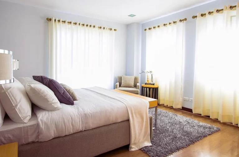
North-facing bedrooms usually get steadier, cooler light, so pale grays can turn icy and some beiges can look flat. If you want the room to feel calm rather than chilly, start with warm neutrals such as cream, beige, or a greige with warm undertones. Soft blues and gentle greens also work well when the room needs a quieter mood.
South-facing rooms and warmer casts
South-facing rooms get stronger warm light for much of the day, which can make many colors look brighter and warmer than they do on the paint chip. That is a good match for cooler colors, since blues, greens, and some blue-grays can balance the warmth without making the room feel stark. Deeper shades can also read cozy here instead of heavy.
East- and west-facing rooms across the day
East-facing rooms tend to feel brighter in the morning and softer later, while west-facing rooms can look muted earlier and glow more warmly in the afternoon and evening. If you choose a color that is already close to the room’s natural cast, the wall color will feel steadier all day. This is where sampling at different times matters most.
Bedroom color checklist table
Use this checklist to compare three palette options side by side. Score each option from 1 to 3 in the last column, with 3 meaning the best fit for that room condition and 1 meaning a weaker fit. The strongest palette usually matches the light direction, respects the floor and furniture undertone, and avoids fighting the fixed finishes.
| Room condition | Wall color family | Bedding palette | Accent color | Why it works | Score |
|---|---|---|---|---|---|
| North-facing, warm wood floor | Cream or warm greige | Ivory, oatmeal, muted sage | Dusty blue | Warms the cool light and keeps wood from looking orange | 3 |
| North-facing, cool gray floor | Soft white or pale blue-gray | White, pale gray, mist green | Charcoal | Stays airy without turning cold or flat | 2 |
| South-facing, walnut furniture | Blue-gray or cool white | White, stone, muted navy | Deep green | Balances warmth and adds contrast without heaviness | 3 |
| East-facing, red-toned carpet | Soft taupe or muted green | Ivory, eucalyptus, blush | Brass or muted rose | Softens the carpet’s warmth and avoids a brick-like effect | 2 |
| West-facing, dark furniture | Soft cream or medium gray | Beige, dusty blue, white | Muted teal | Adds light before evening warmth makes the room feel heavy | 3 |
Choose a base color first
The safest way to start is with the dominant backdrop. Neutral base colors such as white, gray, beige, and cream give you flexibility with accessories and bedding, while warm and cool bases steer the room toward coziness or calm. In most bedrooms, the base color should cover the largest surface area and decide the overall temperature of the room.
Neutral base colors for flexibility
Neutral walls are the easiest starting point when you are building a bedroom color palette for the first time. White, gray, beige, and cream work well as the dominant backdrop because they give you room to add color through bedding, lamps, art, and rugs. That is useful if your bedding changes with the season or if you share the room with someone else.
Warm vs cool bases
Warm colors include reds, oranges, yellows, browns, and beiges, and they tend to create coziness and energy. Cool colors include blues, greens, and purples, and they tend to create calm and spaciousness. If you want the room to feel restful, start with a cool base; if you want it to feel softer and more enclosed, start with a warm one.
When white walls are the right starting point
White walls are a good choice when the room already has strong visual features, such as dark furniture, patterned bedding, or a busy floor. They also work well in bright rooms where you want the window light to stay clean and open. Avoid a cold white if the room has warm floors or cream trim, because the contrast can look accidental rather than planned.
Say your bedroom has a 9-by-11-foot footprint, white trim, and a walnut bed frame. A warm white wall color can keep the room calm while letting the furniture stay the focal point. If you switch that same room to a blue-white, the walls may start fighting the wood tone instead of supporting it.
What colors work with your finishes?
Your flooring, furniture, and trim should anchor the palette before you choose bedding or accent colors. If the fixed finishes lean warm, a warm or balanced wall color usually reads cleaner than a cool one, and the same rule works in reverse for cool finishes. Dark furniture, orange wood floors, and red-toned carpet deserve extra care because they can push the room’s color temperature in a direction you did not plan.
Matching paint to flooring undertones
Warm wood floors usually have yellow, orange, or red undertones, so they pair best with creams, warm grays, muted greens, and dusty blues. Red-toned carpet can pull nearly every wall color warmer, so cooler or slightly muted wall colors often look more controlled. If the floor already feels loud, do not add another strong warm color on the walls.
Working around dark furniture
Dark furniture can make a bedroom feel smaller if the walls and bedding are also heavy in color. A lighter wall color often gives the room breathing room, while the furniture adds contrast and structure. If you want a moody look, keep the wall color and bedding in the same temperature family so the room feels intentional instead of heavy.
Color relationships for bedding, art, and accents
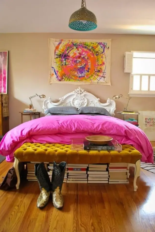
Complementary colors sit opposite each other on the color wheel, so they create stronger contrast; in bedrooms, that works best in small doses, such as blue walls with rust pillows or sage walls with blush art. Analogous colors sit next to each other, so they feel smoother and lower-stress; they work well for bedding, art, and layered accents when you want a quieter room.
In practical bedroom use, complementary schemes are strongest when the wall color stays soft and the contrast appears in bedding, artwork, or one accent chair. Analogous schemes are better when you want the bedding, walls, and decor to feel related, such as cream, sage, and blue-green together. If your room already has strong furniture or a busy floor, analogous palettes usually feel easier to live with.
Coordinating with trim, carpet, and bedding
Trim should usually be the cleanest color in the room, but it does not need to be pure white. If your trim is cream, cool white walls may look off; if the trim is crisp white, beige walls may feel dull unless the beige has enough warmth. Bedding is the easiest place to repeat an accent color, so use it to bridge the gap between the wall color and the floor.
Suppose a room has red-toned carpet, dark espresso furniture, and white trim. A soft sage wall with ivory bedding is more controlled than a warm beige wall with rust pillows, because the sage cools the carpet’s warmth instead of repeating it. That one change can stop the room from reading orange.
Pick a scheme by mood
Choose the mood after you account for the room’s undertones and light. Calm rooms usually lean on soft blues and gentle greens, while cozy rooms often use darker or warmer colors that reduce visual glare. For shared rooms, the best palette is often a balanced neutral base with one color that both people can accept in larger doses.
Calm bedrooms
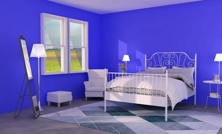
Soft blues and gentle greens are listed as soothing bedroom paint colors, and they are strong choices when the goal is rest and low visual noise. Sea Salt SW 6204 is described as fresh and grounding, and Sleepy Blue SW 6225 is presented as a calming bedroom blue. Pair either with white, cream, or a muted gray so the room stays quiet.
Cozy bedrooms
Darker shades can create a cozy, intimate space, especially in larger rooms or rooms with strong daylight. Warm colors such as browns, beiges, and some muted reds can support that feeling, but keep the brightest accents small. Romantic bedroom colors include dark reds or soft pinks, yet those work best when the rest of the room stays restrained.
Shared bedrooms for couples
Good bedroom color schemes for couples usually start with a neutral base and one shared accent family, rather than two competing favorites on every surface. That makes it easier to blend preferences without forcing a dramatic compromise. One person may want blue, the other beige; a soft gray wall with blue-green bedding and warm wood accessories can bridge both.
A common first-timer mistake is picking a paint swatch without considering the room’s light, bedding, and furniture tones. Picture a couple with one person wanting charcoal and the other wanting cream. The room works better if the walls stay soft and neutral, the bedding carries the stronger color, and the accent layer handles the bolder preference.
How do you use the 60-30-10 rule in a bedroom?
Use the 60-30-10 rule to divide the room into dominant, secondary, and accent layers. In a bedroom, this rule is often applied as about 60% wall and major backdrop color, 30% bedding or larger textiles, and 10% smaller decor. The rule works best when the 60% layer is the calmest one, not the loudest.
Dominant color choices for walls
The dominant color should usually be a neutral base color or a softened version of your main hue. White, gray, beige, and cream are safe if you want the room to stay flexible, while a muted blue or green can become the dominant wall color if the finishes support it. This is the layer that sets the whole room’s temperature.
Secondary color choices for bedding and larger textiles
The 30% layer belongs in bedding, curtains, upholstered benches, or large rugs. Use it to bridge the wall color and the accent tone. If the walls are cream, a dusty blue duvet or sage quilt can add color without overwhelming the room. If the walls are blue-gray, beige bedding can keep the room from feeling too cold.
Accent color choices for smaller decor
The accent color is the smallest proportion, and it should live in pillows, art, lamps, rugs, or decor. This is where you can use a stronger tone like navy, brass, muted rust, or deep green without letting it take over. If the accent color starts appearing on the walls, it has stopped being an accent.
How can you transfer a bedroom palette to the rest of the home?
Start with the same undertone logic you used in the bedroom, then shift the intensity to match each room’s purpose. Hallways, living rooms, and bathrooms can share a common base color or repeat the bedroom’s accent family in different proportions. That creates flow without making the whole home feel identical.
A bedroom palette often transfers best when the wall color becomes lighter or darker in the next room, while the accent color stays consistent. For example, a soft sage bedroom can lead into a warmer neutral hallway and a more saturated green art choice in the living room. This is especially useful when you want one home-wide scheme instead of isolated rooms that feel disconnected.
Official color reference: Benjamin Moore Collections Fan Deck

- Official Benjamin Moore color references
- Box format stores neatly
- Useful for comparing many colors
Based on the listed product details, this fan deck is useful when you need a broad reference for comparing many shades from the same brand. It is a practical choice for homeowners who want to compare wall colors against trim, flooring, and bedding before narrowing the field. The drawback is simple: a fan deck is a reference tool, not a wall sample, so it cannot show the full effect of room light.
The box format also stores neatly, which helps if you plan to revisit color choices over several days. Still, it works best as a first filter, not as the final decision on its own.
Wall sample check: Samplize Benjamin Moore Van Deusen blue

- Peel-and-stick for easy wall testing
- Specific Benjamin Moore shade
- Simple way to judge bedroom lighting
This peel-and-stick sample is useful when you want to see a specific blue on the wall without committing to a painted test patch. Based on the published details, it is a straightforward way to judge how a chosen shade reads in bedroom light, especially on different walls and at different times of day. The main drawback is that one color sample is narrow by design, so it helps with testing but not with broader palette planning.
Use it if you are already leaning toward a blue wall and need a repeatable check against your flooring, trim, and lamps. It is less helpful if you still need to compare warm and cool families side by side.
Color wheel guide: Mcbazel 3 pieces Artist color mixing Guides wheel

- Makes color theory easier to see
- Includes large and pocket sizes
- Coated paper for everyday use
This set is helpful for people who want a visible reminder of complementary and analogous color choices. Based on the product details, the large and pocket sizes make it easier to keep the color wheel nearby while comparing bedding, art, and paint chips. The drawback is that it is a teaching tool, not a decor sample, so you still need a wall-color reference before making the final call.
It is most useful if you are unsure whether your accent color should contrast with the wall color or sit beside it. That makes it a practical aid for first-time palette building.
Neutral backdrop: Livelynine neutral textured wallpaper

This removable cream textured wallpaper is a renter-friendly option when you want a neutral dominant backdrop without permanent paint. Based on the published product details, it can support a softer bedroom palette and keep accessory choices open. The drawback is that textured vinyl is not the same as a painted wall, so sheen and pattern may change how the room feels in bright light.
It is best for rooms that need a quick neutral reset, especially when you want cream to sit in the background while bedding and decor carry the color.
Mistakes to avoid
The most common errors happen when people choose color before checking the room’s undertones. Warm and cool finishes can clash quickly if you pair a cool wall with orange wood floors or a warm wall with cool gray trim. Finish sheen also matters: glossier finishes reflect more light and can make a bedroom feel busier, while flatter finishes usually read calmer.
- Do not mix warm and cool finishes without a plan. A cool blue wall can look disconnected next to orange wood, and a creamy wall can look yellow beside a blue-white trim.
- Do not skip day and night sample checks. Paint can read differently in morning light, afternoon sun, and under bedside lamps. Check the sample on more than one wall, including the wall closest to the window and the wall across from it.
- Do not choose sheen without considering calmness. Higher sheen reflects more light and can reveal wall flaws; lower sheen usually feels quieter in a bedroom.
- Do not let the accent color take over. If pillows, art, and lamps all shout louder than the walls, the room can feel busy instead of restful.
- Do not treat all whites, grays, or beiges as the same. Their undertones decide whether they support the floor, furniture, and trim or fight them.
To test paint properly, compare samples on at least two walls with different exposure, then look at them under daylight and under the main bedroom lamp type you use at night. Repeat the check after the room has changed from bright to dim. That simple routine catches most surprises before you commit to gallons of paint.
Frequently asked questions
How do I choose a bedroom color scheme?
Start with the undertones in your flooring, furniture, and trim, then check the room’s light direction, and only after that choose the wall color. Build the rest of the scheme from there using the 60-30-10 rule. That order keeps the room from feeling mismatched once the color is on the walls.
What colors go well with white walls in a bedroom?
White walls pair well with nearly any accent family, but the cleanest choices usually repeat a single mood: soft blue and gray for calm, beige and clay for warmth, or muted green for balance. If the white is warm, keep the accents warm or earthy. If the white is cool, choose crisp blues, greens, or charcoal.
How do I choose a bedroom color palette if I have dark furniture?
Dark furniture usually works best with a lighter wall color and a mid-tone bedding layer. That prevents the room from feeling too heavy. Choose a wall color with enough lightness to give contrast, then repeat the furniture’s undertone in small accents so the space feels connected.
What bedroom colors make a room feel calm?
Soft blues and gentle greens are the safest starting points for a calm bedroom, especially when paired with white, cream, or soft gray. Muted neutrals also work if the room has strong daylight or busy finishes. Keep contrast moderate so the eye does not keep jumping around the room.
What are good bedroom color schemes for couples?
Good couple-friendly schemes usually begin with a neutral base and one shared color family that both people can live with. Soft gray with blue-green accents, cream with muted sage, or beige with dusty blue are all workable starting points. The key is to keep the strongest color in the smallest proportion.
Products related to this article
Sponsored / affiliate links. As an Amazon Associate I earn from qualifying purchases. I may earn additional commission from eligible campaigns.