How to Design a Bedroom Accent Wall: Choose the Right Wall
Design a bedroom accent wall by choosing the wall behind the bed unless another wall solves a problem with light, scale, or proportions. Pick the wrong wall or finish and the room can feel crowded, flat, or off-balance. This guide shows how to choose the wall, finish, color, and styling so the feature works with your bedroom, not against it.
- Best default: the wall behind the bed.
- Use an alcove or recessed wall if the room has one and you need better proportion.
- Pick one finish that solves a real problem: calm, pattern, height, warmth, or light.
- In small bedrooms, keep the palette controlled and the pattern scale restrained.
- For a black accent wall, balance it with lighter bedding, curtains, and rug tones.
Why the headboard wall makes the strongest focal point

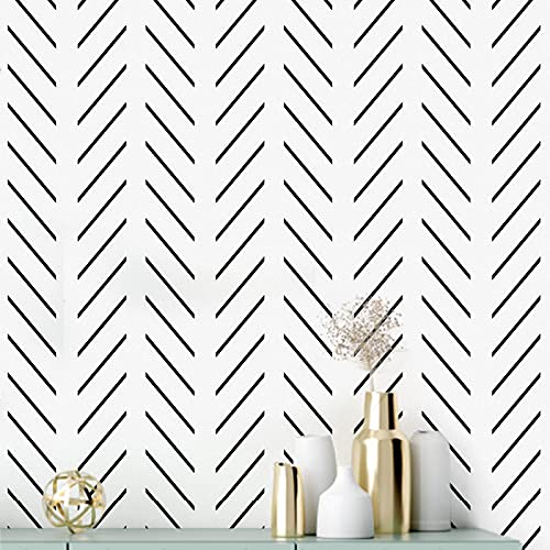


The short answer is usually the wall behind the bed, because it creates the clearest focal point and keeps circulation open. If the bedroom has a recess, niche, or alcove, that surface can be an even better candidate when you want the accent wall to improve proportion rather than just add decoration.
The wall behind the bed is the strongest starting point in most rooms because it frames the bed, supports the room’s largest piece of furniture, and leaves the main traffic paths open. Homes & Gardens says the most successful bedroom feature wall is behind the bed, which matches the standard layout of most bedrooms. For light-reflection and finish behavior, paint manufacturers such as Sherwin-Williams and Benjamin Moore both note that lower-sheen finishes look softer and reveal fewer wall flaws, while higher-sheen finishes reflect more light and show more surface variation.
An alcove or recessed wall can be even better when the bedroom has one. Homes & Gardens suggests a recessed wall can be highlighted with color, which helps when you want the accent to fix proportion problems instead of adding another busy surface. That kind of placement is especially useful when the room needs a focal point without sacrificing openness.
Why the wall behind the bed usually works best
Put the accent wall where the eye lands first. In most bedrooms, that is the headboard wall, because it frames the bed, supports the room’s largest piece of furniture, and gives the rest of the room a clear order. It also keeps the room from feeling visually split into competing zones.
That placement also helps avoid a fragmented look. Decoist notes that accent walls are a recurring interior favorite and that bedrooms are a good place to experiment, but it also says the feature can help small bedrooms avoid a chopped-up look when the right wall is chosen. In practical terms, the best wall is the one that reinforces the bed rather than competing with it.
When an alcove or recessed wall is the better choice
Choose a recessed wall when the bedroom has an awkward niche, a partial bump-out, or a built-in frame that already reads like a destination. That shape can hold stronger color, paneling, or wallpaper without making the room feel split apart.
If the bed sits off-center, a recessed zone can also create balance by giving the accent a clear boundary. A full wall is not always the best answer. A contained surface can be easier to live with in a tight room, especially when the rest of the bedroom needs to stay visually quiet.
How to avoid splitting up a small bedroom
In a small bedroom, avoid using two competing feature walls. One accent surface is usually enough. Too many breaks in color or texture can make the room read smaller, even when each finish looks good on its own. The safest small-room move is usually one focal wall and calmer surrounding surfaces.
Use vertical emphasis when possible. Slats, tall painted shapes, or long panel lines pull the eye upward, which helps the room feel taller and less chopped up. For visual expansion, lighter reflective surfaces tend to open a room more than dense contrast, according to common interior-paint guidance from major paint brands.
Accent wall decision matrix

Use this table as a planning tool before you choose materials. Homes & Gardens frames the topic as a feature-wall guide with 10 ideas, while its bedroom paint coverage includes 12 approaches. The point is not more ideas; it is matching the finish to the room’s exact problem. The criteria below use simple planning ranges: cost tier, DIY difficulty, renter-friendliness, light reflection, and small-room impact.
| Finish | Cost tier | DIY difficulty | Renter-friendliness | Light reflection | Small-room impact | Best placement | Avoid this if… |
|---|---|---|---|---|---|---|---|
| Matte paint | Low; typically the least expensive option | Easy; beginner-friendly | Low to medium if painted over before move-out | Low; soft, low-glare finish | Soft, calm, visually quiet | Behind the bed; arches; full-wall tone-on-tone color | You need more bounce in a dark room. |
| Satin paint | Low | Easy | Low to medium if painted over before move-out | Medium; more sheen than matte | Slightly brighter and crisper | Bold color blocks; panel details; shaped walls | Wall flaws are highly visible. |
| Patterned wallpaper | Medium | Moderate | Medium to high, depending on product | Varies by print and finish | Strong focal point, more visual activity | Behind the bed; a single recessed wall | The room is already busy with textiles. |
| Mural wallpaper | Medium to high | Moderate | Medium to high, depending on product | Varies by product | Big statement, can overwhelm tiny rooms | Large headboard wall with open sightlines | You want a quiet backdrop. |
| Vertical wood slats | Medium to high | Moderate to hard | Low | Low to medium | Raises the eye line and adds height | Behind the bed; narrow or tall rooms | The room already feels too vertical and narrow. |
| Paneling | Medium to high | Moderate | Low | Low to medium | Adds warmth and structure | Headboard wall; rooms that need more definition | You want a light, airy read. |
| Brick or faux brick | Medium | Moderate | Low | Low | Textural, heavier, more grounded | Behind the bed; loft-like or industrial rooms | The bedroom is already dark and compact. |
| Textured finishes | Medium to high | Moderate to hard | Low to medium | Low | Depth without relying on color alone | Feature wall with simple furnishings | You want a low-effort, low-visual-risk solution. |
Best-use scenarios: matte paint for the fastest calm reset, satin paint for a slightly livelier wall with more light bounce, patterned wallpaper for a clear focal point, mural wallpaper for a dramatic headboard wall, vertical slats for height, paneling for structure, brick for grounded texture, and textured finishes for depth when color alone is not enough.
Which finish fits your room?
The best finish depends on what the bedroom needs most: less effort, more pattern, more height, or more warmth. For a plain room, paint often solves the problem fastest. For a room that needs mood or softness, wallpaper or texture may do more with the same wall area. If the room is being rented, choose a removable or easily reversed finish where possible.
Paint for the simplest reset
Paint is the easiest and most affordable option. It is also the cleanest answer when you want a strong color change without adding thickness or pattern. Matte paint gives a softer look. Satin adds some sheen, which can help a dark room feel less flat. Sherwin-Williams and Benjamin Moore both describe sheen as a key factor in how much light a painted wall reflects and how much surface detail shows through.
Paint works well on arches, blocks, and full walls. It is also the best choice when the wall has imperfections you want to quiet rather than magnify. For renters, paint is only practical when lease rules and repainting expectations allow it, which is why it is often less renter-friendly than peel-and-stick or other reversible options.
Wallpaper for pattern or mood
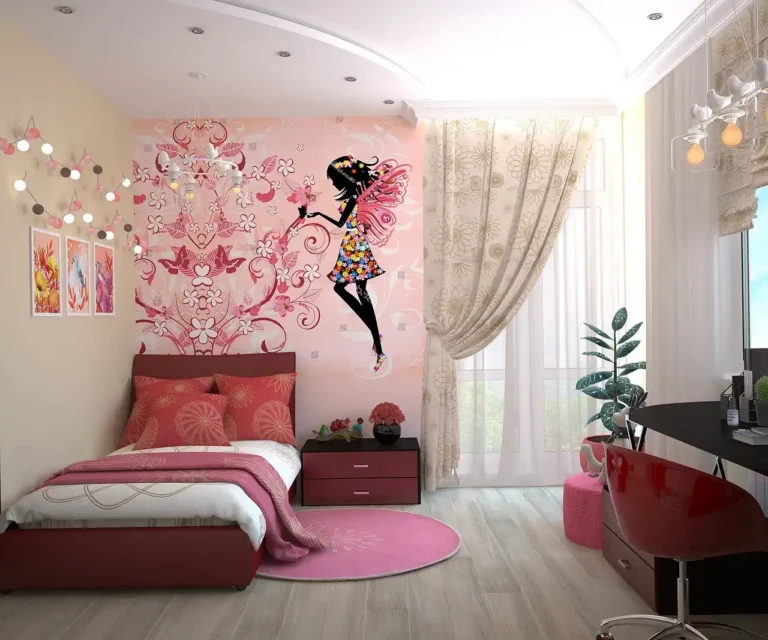
Wallpaper is a quick way to add pattern or drama, and it usually gives more visual detail than paint alone. Patterned and mural-based papers can lean floral, geometric, nautical, or dark floral, depending on the room’s mood. The strongest use is usually one wall, not the whole room, unless the pattern is subtle and the room is large enough to carry it.
It is a strong low-commitment option compared with permanent finishes, especially in rooms where you may want a different look later. For more examples of how it changes the room, see the related bedroom accent walls ideas that use wallpaper, paint, and texture in different ways.
Wood slats, paneling, brick, and textured surfaces
Wood slats and paneling add warmth and architectural interest. Vertical slats add height, while panels add structure. Oak, walnut, MDF, and wood-look boards are all viable, and slats can double as a headboard alternative when the bed wall needs more presence.
Brick or faux brick brings industrial character and depth behind the bed. It can stay raw or be painted. Textured finishes such as grasscloth, fabric-backed panels, 3D wall art additions, tile, or faux-stone effects work when you want depth that does not depend on color alone.
Picture a roughly 10-by-12-foot bedroom with a low headboard and limited natural light. A mural packed with contrast can feel busy fast, but a matte charcoal wall behind the bed may give the room one strong anchor without adding extra fragments. In a room like that, the safest choice is often the one that simplifies the view rather than adding another layer of detail.
What color should you choose?
Choose color to solve a room issue, not to chase a trend. Dark red, harbor yellow, charcoal gray, blue, purple, olive, sage, terracotta, and blush all work differently depending on bedding, curtain weight, floor tone, and daylight. Dark blue is one example Decoist highlights for bedroom accent walls.
How dark colors change the feel of the room
Dark colors can make a bedroom feel more enclosed and restful, which is useful when the room is wide, bright, or visually scattered. Charcoal gray, deep blue, olive, and purple tend to ground the bed wall and make lighter bedding stand out. This is why dark finishes often work well when the goal is mood rather than brightness.
They are less useful when the room already lacks daylight. In a dim bedroom, a dark wall can disappear into the corners and make the space feel smaller unless the rest of the palette is light enough to balance it. Finish sheen matters here too: a matte surface absorbs more light, while a satin surface sends back a little more.
When sage, terracotta, blush, or charcoal work best
Sage and blush tend to feel softer next to pale wood, cream textiles, and light curtains. Terracotta adds warmth and works well when the room needs more body. Charcoal is the most flexible of the dark options when you want contrast without a loud color story.
Harbor yellow can help a room that feels cold or underlit. Deep red reads more intense, so it is best when the bed, rug, and curtains are quiet enough to keep the wall from dominating everything else. If the room is already heavy with pattern, a softer tone usually works better than a saturated one.
How to match the wall to bedding and curtains
Match the wall to the strongest textile in the room. If the duvet already has a busy print, use a quieter wall finish. If the bedding is plain, the wall can carry more color or pattern.
Repeat the accent color sparingly elsewhere. Use it in one pillow, a throw, a lamp detail, or a piece of art. Too many repeats can flatten the room into a theme. The goal is coordination, not duplication.
Can a small bedroom handle one?
Yes, if the wall choice is disciplined. A small bedroom can benefit from an accent wall because it creates an instant focal point, but it should not chop the room into smaller pieces. Vertical emphasis, lighter finishes, and controlled pattern are the safest moves. Small-room guidance from interior design sources consistently favors one strong focal wall over several competing features.
How to make a room look bigger with accent wall
Use one wall rather than several. Let the feature wall support the bed and keep the other surfaces calm. Lighter paint, soft matte finishes, or a restrained tone-on-tone treatment can make the room feel more open than a high-contrast pattern. When the room is tight, simplicity usually reads bigger than detail.
Mirrored or reflective details can help when light is scarce, but keep them limited. A wall that reflects too much can feel harsh at night. A small amount of reflection can expand the sense of space; too much can make the room feel visually restless.
When lighter finishes or mirrors help
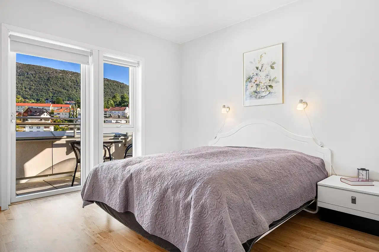
Lighter finishes help when the room has one small window, low ceilings, or dark flooring. A pale sage, blush, or warm off-white accent wall can still read as a feature without pulling the walls inward.
Mirrored finishes are often best used in small doses, such as narrow panels or framed inserts. A full mirrored wall can be harder to live with in a bedroom because it may feel too exposed. It can also amplify clutter instead of hiding it, which is rarely what a compact bedroom needs.
What makes a wall look too busy in a compact room
A wall looks too busy when the pattern scale is large, the contrast is sharp, and the rest of the room already carries strong prints. That combination can overpower a small footprint quickly. The problem is usually not one decorative choice; it is the overlap of several loud choices at once.
Suppose a narrow bedroom has a plaid duvet, patterned curtains, and a geometric wallpaper accent wall. The room may feel crowded because every major surface is competing for attention. Simplify one of those layers, and the wall usually works better. This is where restraint matters more than adding another object.
How do you keep it coherent?
Coherence comes from shape, repetition, and restraint. The accent wall should connect to the bed, not fight it. Headboard shape, curtain weight, rug tone, and pillow pattern should all point in the same direction, even if the room has only one feature surface. A bedroom usually looks more finished when one element leads and the others support it.
Headboard shape and wall shape
Match the wall treatment to the headboard line. An arched painted shape pairs well with rounded furniture, while a paneled grid suits a more structured bed frame. Vertical slats work especially well with tall headboards because they extend the visual line upward.
If the bed has a low, simple frame, a highly detailed wall can overwhelm it. In that case, keep the wall finish cleaner and let the furniture stay readable. A strong wall and a strong headboard can work together, but only if their shapes do not fight.
Where to repeat the accent color in small amounts
Repeat the accent color in about two or three small places at most. A pillow trim, a throw, and a lamp base are enough in many bedrooms. The goal is to make the wall feel intentional, not duplicated across every surface.
Use surrounding walls in complementary colors so the accent has room to breathe. Neutral or muted adjacent walls often help the feature wall read more clearly. Keeping the repeats small also protects the room from feeling overdesigned.
How rugs, pillows, and curtains should relate to the wall
Let the rug and curtains support the wall rather than compete with it. If the wall is dark, lighter bedding and curtains can keep the room from closing in. If the wall is soft and pale, deeper textiles can give the bed more presence.
Keep pattern scale consistent. A large floral wall pairs better with plain curtains and a textured rug than with several competing prints. In practical terms, choose one star and let the rest of the room be a supporting cast.
Frequently asked questions
Should a bedroom have an accent wall?
It can, but it does not need one. A bedroom benefits from an accent wall when the room needs a focal point, better proportion, or more warmth. If the room already feels balanced and calm, a plain finish may do the job better than a feature wall.
Where should an accent wall go in a bedroom?
The wall behind the bed is usually the best place because it frames the main furniture and creates a clear anchor. If the room has an alcove or recessed wall, that can be a smarter choice. Avoid placing the accent where it breaks the room into awkward pieces.
How to decorate a room with a black accent wall
Balance a black accent wall with lighter bedding, curtains, and a rug so the room does not feel heavy. Use a matte finish for a softer read or a satin finish for a little more sheen. Keep nearby wood tones, lamps, and textiles simple and consistent. A black wall works best when the other major surfaces stay lighter and less busy.
Black accent wall checklist: lighter bedding, lighter curtains, one or two warm wood accents, controlled pattern, and enough natural or lamp light to keep corners from feeling sealed off.
Products related to this article
Sponsored / affiliate links. As an Amazon Associate I earn from qualifying purchases. I may earn additional commission from eligible campaigns.