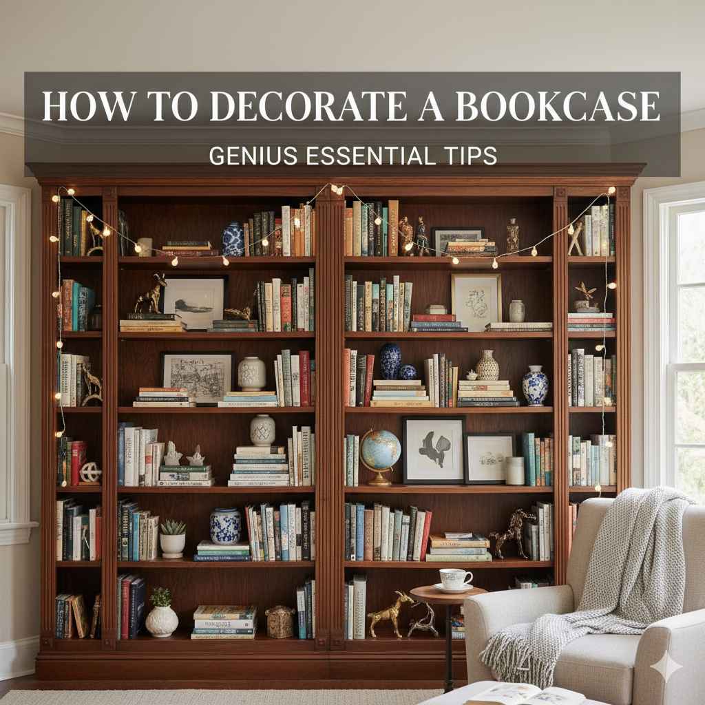
Decorating a bookcase is easy once you know the simple rules: mix books with decorative objects, use the rule of thirds for balance, vary heights, and leave some empty space. Follow these steps to transform an ordinary shelf into a stunning focal point without feeling overwhelmed.
Is your bookcase overflowing? Does it look more like storage than a showcase? You are not alone! Many of us struggle to turn that big shelf into something stylish. It can feel tricky to mix books with knick-knacks so it looks balanced and intentional. But don’t worry, it’s simpler than it looks. Think of it like prepping your car for a road trip—a little organization goes a long way. We will walk through easy, step-by-step tips today. You’ll learn how to create a beautiful, functional display that shows off your personality. Let’s get started on making your bookcase shine!
Why Bookcase Styling Matters More Than You Think
A bookcase isn’t just for holding heavy books; it’s a major piece of furniture in almost any room. When styled well, it adds character, color, and warmth. When styled poorly (or not at all), it can look cluttered and messy, making the whole room feel smaller. Think of your bookcase as prime real estate in your home decor. We want it to look polished and intentional, not like a dumping ground.
Good styling adds structure. It helps guide the eye around the room. It’s a chance to display hobbies—maybe you love travel, or perhaps you collect vintage cameras. By mastering a few basic decorating principles, you can achieve a professional look without buying a mountain of new stuff. We focus on balance, texture, and pacing. Ready to see how?

Step 1: The Essential First Clean-Out (Prep Work is Key)
Before you can style anything, you must clear the stage. This is just like giving your car a thorough wash before polishing the paint. You need a clean, blank slate. If you skip this, you will just be decorating clutter.
Empty Everything Out
Take every single item off the shelves. Yes, everything. This includes books, little statues, old papers, and anything else hiding back there. Place it all on the floor or a cleared table.
Sort and Curate Your Collection
Now, look at what you have. Be ruthless but fair! This helps you decide what truly deserves prime shelf space. We can sort things into three simple piles:
- Keep & Display: These are your favorite books (the ones you reference often or absolutely love the look of) and meaningful décor items.
- Store Elsewhere: These are books you’ve finished but don’t need immediate access to, or décor items that just don’t fit the style anymore. Put them in boxes to store or donate.
- Donate/Sell: Get rid of things you no longer use or appreciate. Less is genuinely more when it comes to bookshelf styling.
The Quick Dust and Wipe Down
With the shelves empty, give them a thorough wipe down. Use a damp cloth and maybe a little wood polish if the shelf itself needs a refresh. Clean shelves make everything you put back on them look instantly better. This groundwork takes five minutes but makes a huge difference!
Step 2: Mastering the Book Placement (Your Anchor Items)
Books are the bread and butter of a bookcase. How you arrange them sets the entire tone. You don’t want solid walls of books; that feels heavy and stops the eye from moving.
The Horizontal Stacking Trick
Don’t place all your books vertically. Stacking a small pile horizontally breaks up the visual line, giving you a perfect platform (a plinth!) to display a small piece of décor on top. Try stacks of three or five books.
- Practical Tip: Use the horizontal stack to anchor a heavier item, like a small lamp or a substantial piece of pottery.
Vary the Heights (Go Vertical and Horizontal)
Mix it up! If you have a tall stack of hardcovers standing up, place a short stack of paperbacks horizontally next to them. Look at the shelves as a graph—you want peaks and valleys, not a flat line.
The “Spine Out” Debate (Color or Content?)
Most people display books spine-out so you can read the title. However, for a more curated, designer look, some decorators turn a few beloved books backward (showing only the aged paper edge). This adds texture and calms down overwhelming color palettes. Do this sparingly, perhaps on one shelf section, to add visual quiet.
Tip: Use the “Rule of Thirds” for Books
Aim to have roughly one-third of the shelf space dedicated to books, one-third dedicated to décor, and one-third left empty (negative space). This keeps the shelf from feeling dense.
Step 3: Introducing Decorative Elements (The Visual Interest)
This is where your personality shines through! The goal is to pair the weight of the books with lighter, interesting objects. These objects should vary in size, texture, and shape.
Choose High-Impact Objects
Select items that mean something to you or have an interesting shape. Think about materials:
- Natural Elements: Small pieces of driftwood, polished stones, shells, or small air plants.
- Art & Sculpture: Small framed photos, unique abstract sculptures, or vintage awards.
- Vessels: Interesting vases, ceramic bowls, or antique teacups.
Safety Note: When choosing items, remember that heavy glass or ceramic pieces look best supported by a horizontal book stack underneath, rather than just sitting on the shelf edge. This enhances stability, which is crucial for safety, especially if you have pets or children.
The Power of Artwork
You don’t need giant paintings. Small, meaningful pieces of art can lean against the back of the shelf. You can layer them! Place a small, square photo frame in front of a slightly larger, leaning piece of canvas art. This adds amazing depth.
Incorporate Something Green
Every great interior design scheme benefits from life. A small, low-light plant (like a ZZ plant or a small Pothos) instantly makes the shelf feel alive and less static. Ensure the spot gets some ambient light, or opt for high-quality faux greenery.
Step 4: Creating Visual Flow and Balance
This is the secret sauce that separates “clutter” from “curated.” Balance doesn’t mean mirroring everything perfectly; it means distributing visual weight evenly across the entire unit.
Work Shelf by Shelf (Instead of Row by Row)
Don’t decorate shelf A completely, then move to shelf B. Instead, look at the whole unit. If you load the bottom left side with heavy objects, put something lighter or taller on the top right side to balance it out visually.
The Importance of Negative Space (Breathing Room)
This is perhaps the most critical beginner mistake to avoid: completely filling every available inch. Empty space—the “negative space”—is essential. It allows the eye to rest and lets the curated items truly stand out. If a shelf looks too crammed, take three things off it. Seriously, try it!
Varying Heights and Depth
Use objects of different heights to create a rhythm across the unit. If you have a tall vase on the far left, maybe use a tall stack of books plus a small object in the middle, and a medium-height item on the right. You are creating an invisible zig-zag pattern across the shelves.
Additionally, push some items right to the back—especially anything flat, like small art. Pull items forward that have lovely texture or detail. This layering creates depth, making the overall display look richer.
Step 5: Utilizing Color and Texture Strategically
Color and texture add immediate richness. This step is less about what you put there and more about how those items look together.
Color Blocking for Impact
If you have books with wildly different colored spines, you can group them by color on a single shelf. For example, put all your blue and green spines together. This creates a block of intentional color. You can then contrast this with a shelf where you’ve grouped neutral-colored décor items (like white ceramics or wood objects).
Using Trays and Baskets for Cohesion
If you have a lot of small, mismatched items (like remotes, small charging cables if this is in an office, or just random small gifts), group them together using a stylish tray or a woven basket. This instantly transforms a pile of “stuff” into a single, intentional design element. Baskets are fantastic for making a shelf look less busy.
Texture Contrast is Essential
A shelf full of paper and flat wooden frames looks boring. You need texture contrast. Pair smooth ceramic objects with rough, woven baskets. Pair the matte finish of a book cover with a shiny metallic trinket. This sensory variation keeps the eye engaged as it scans the shelf.
For more insights on selecting materials for interior design that enhance focus and mood, resources like the Color Wheel Pro guide on color theory can offer helpful background on how items interact visually.
Advanced Bookcase Styling Techniques for Beginners
Once you’ve mastered the basics of spacing and object selection, try these techniques to elevate your look further.
The Anchor Piece Strategy
Select one shelf—often the middle or most central shelf—to be your “hero” shelf. This shelf gets your most meaningful, visually striking, or largest decorative piece. Everything else on the surrounding shelves should support that central piece without competing with it. It acts as the main focal point.
Creating Mini-Vignettes
Instead of scattering single items across the shelf, try grouping items in small clusters of three (the “rule of threes” applies here too). For example: A stack of two books (horizontal), a framed photo leaning on the stack, and a small sculpture next to it. This creates a tiny scene or “vignette.” Grouping items makes them feel related and intentional.
Using Bookends Creatively
Ditch the plain metal bookends. Bookends are functional décor! Find interesting, heavy objects to use as bookends—like smooth river stones, interesting metal shapes, or even vintage camera lenses (if they are heavy enough). Or, use a sturdy, beautiful book of the same size lying horizontally to prop up the vertical books.
| Styling Element | Beginner Goal | Expert Tip |
|---|---|---|
| Book Placement | Keep most books spine-out. | Mix vertical and horizontal arrangements; use a few backward-facing spines for texture. |
| Object Grouping | Place one object per shelf section. | Create small vignettes using three coordinated items together. |
| Empty Space | Don’t fill every spot. | Ensure roughly 30% of the shelf surface is visible (negative space). |
| Color Scheme | Use existing book colors. | Group books by spine color for impact, contrasted next to neutral décor. |
Bookcase Organization for Different Functions
How you decorate also depends on what the bookcase is actually holding. A shelf in your kitchen living area will look different than a dedicated library unit.
The Everyday Office Bookcase
If this shelf holds reference materials or documents, function must come first. Use matching file boxes or stylish storage bins on the lower shelves to hide necessary but unattractive items (like printer paper, manuals, or spare cords). This contains the visual “noise” so the upper shelves can be prettier.
The Living Room Display Case
Here, aesthetics rule. You can afford more empty space and focus more on art and collected items. Consider using the back panels. Sometimes, simply lining the back of the shelf with beautiful wallpaper or fabric samples elevates everything without needing expensive objects.
The Bedroom Bookcase (Personal Sanctuary)
In a bedroom, the look should be calming. Use softer textures—think woven baskets over metal bins and incorporating more neutral colors. Keep clutter minimal. This space should invite relaxation, so avoid overly busy or high-contrast displays.
Tools You Might Need (Simple Setup)
You don’t need a tool belt for this job! Good planning and a few household items are enough to get a professional result. This is practical home maintenance, not complex cabinetry!
- Microfiber Cloths/Duster: For the initial clean and ongoing dusting.
- Ruler or Small Level (Optional): If you want to ensure that leaning artwork is perfectly angled.
- Small Boxes or Bins: Crucial for corralling small, loose items. Choose matching colors if possible.
- Painter’s Tape (Optional): Handy if you are temporarily attaching lightweight fabrics or paper to the back panel while experimenting with backgrounds.
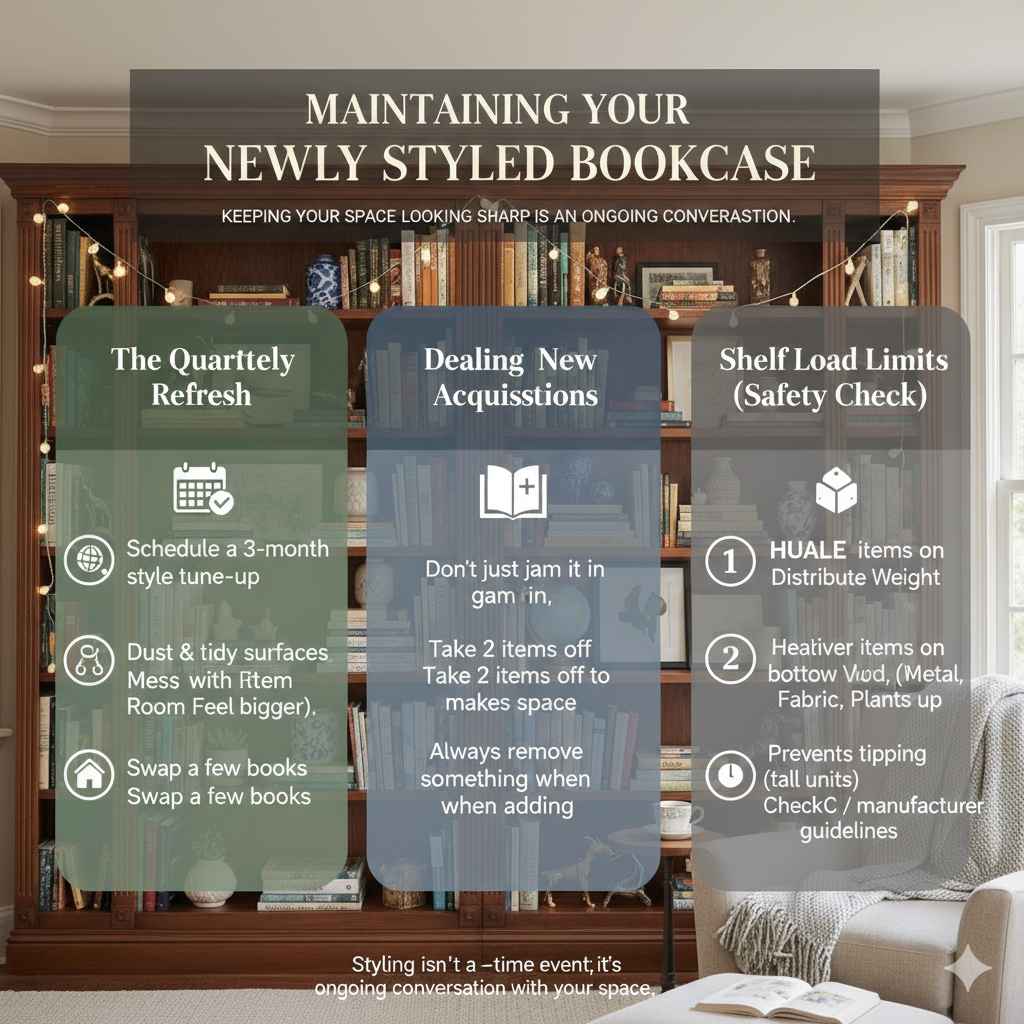
Maintaining Your Newly Styled Bookcase
You’ve done the hard work! Now, how do you keep it looking sharp? Styling isn’t a one-time event; it’s an ongoing conversation with your space.
The Quarterly Refresh
Schedule a quick check-in every three months. This isn’t a full clean-out, but a style tune-up. Dust surfaces, rotate a few décor items (move that vase from the top shelf to the middle), and swap out a few books based on what you’ve recently read.
Dealing with New Acquisitions
You buy a new, great-looking book. Where does it go? Don’t just jam it in wherever there’s a gap. Take two other items off the shelf—perhaps two smaller paperbacks that look a bit dated—to make room for the new one. Always remove something when adding something new to maintain that crucial balance.
Understanding Shelf Load Limits (A Quick Safety Check)
While we aren’t building heavy machinery here, it’s good to remember that bookshelves have limits. Experts in furniture safety stress that weight should be heavier on the bottom shelves. Heavy hardcovers or large collections should anchor the base, while lighter objects (like small frames or paperbacks) can go higher up. This prevents tipping, especially with taller, freestanding units. You can check weight capacity guidelines published by organizations like the Consumer Product Safety Commission (CPSC) for general guidance on household stability, though specific furniture ratings vary widely.
FAQ: Beginner Questions About Decorating Bookcases Answered
Q1: How do I make my books look better if the spines are all different colors?
A: Don’t try to mix every color wildly. Instead, group books by color shades on separate sections of the shelf. You can also use clear bookends and intentionally expose the pages of a few books by turning them backward (spine hidden). This creates visual breaks where the harsh colors would otherwise clash.
Q2: Should I put my biggest decorative items on the top shelf or the bottom shelf?
A: Generally, place your heaviest and largest items on the bottom shelves. This keeps the unit stable and visually grounded. Tall, but lighter objects like hollow vases can go higher up to add vertical interest against the ceiling line.
Q3: How many decorative objects should I have per shelf?
A: There isn’t a strict number, but focus on visual weight instead. A good rule of thumb is aiming for 2 to 4 distinct “zones” or groupings per shelf. For example, one zone of two stacked books with a figurine on top, and another zone featuring a single tall vase. Remember to leave significant empty space between zones.
Q4: Is it okay to use real photos in my bookcase display?
A: Absolutely! Real photos make the space feel personal. However, use matching or complementary frames (e.g., all thin black frames or all wood frames). This cohesive look prevents the photos from looking like random clutter amongst your décor.
Q5: What is “negative space” in bookcase decorating?
A: Negative space is the empty area on the shelf—the space where there is nothing placed. It might seem strange at first, but this empty space is essential for good design. It allows the eye to rest and prevents the shelf from looking crowded or messy. When every inch is filled, even beautiful items can get lost in the clutter. By leaving some areas open, you make the books and décor stand out more clearly. Think of negative space as a frame that highlights what you choose to display. A good rule is to step back and check: if the shelf feels too busy, remove a few items and let it breathe.
Conclusion: Turn Your Bookcase Into a Personal Showpiece
Decorating a bookcase doesn’t require expensive décor or professional design skills. With a little planning and a few simple principles—clearing clutter, balancing books with objects, varying heights, and leaving breathing room—you can transform an ordinary shelf into a stylish focal point.
Remember, your bookcase should tell a story about you. Mix your favorite reads with meaningful pieces, add a touch of greenery, and play with color and texture. Start with small changes, adjust as you go, and don’t be afraid to experiment. The best-looking shelves evolve over time.
Most importantly, keep it balanced, keep it personal, and keep some space empty. That combination will make your bookcase feel thoughtful, welcoming, and beautifully put together.