Art Deco design is making a glamorous comeback, and it’s no surprise why. Its bold lines, metallic accents, and dramatic colors create a sense of timeless luxury that works beautifully in modern spaces. Whether you’re revamping a living room, planning a wedding theme, or creating graphics for your Pinterest boards, choosing the right Art Deco color palette can instantly transform your project.
In this guide, I’ll share 13 stunning Art Deco color palettes you can try. Each one comes with styling inspiration, practical tips, to help you bring these palettes to life. Let’s dive into the world of rich jewel tones, gleaming metallics, and bold contrasts.
Idea #1: Black and Gold Glamour

Nothing says Art Deco quite like the striking combination of black and gold. The dark background sets the stage while shimmering gold accents add instant sophistication. Think black lacquer furniture, golden wall sconces, or even dramatic wallpaper with metallic patterns.
This palette works beautifully for both home décor and event styling. In interiors, it feels opulent but also modern when paired with sleek lines. For weddings or parties, it adds a “Great Gatsby” feel that never goes out of style.
Idea #2: Emerald Green and Brass

Emerald green captures the lush vibrancy of the 1920s, while brass tones keep it grounded and elegant. Use this combo for velvet sofas, brass bar carts, or accent tiles in a bathroom refresh.
This palette feels fresh and inviting, perfect if you want to add richness without going too dark. Layer in cream or ivory details to keep it balanced. Emerald and brass also shine during winter months when jewel tones feel especially cozy.
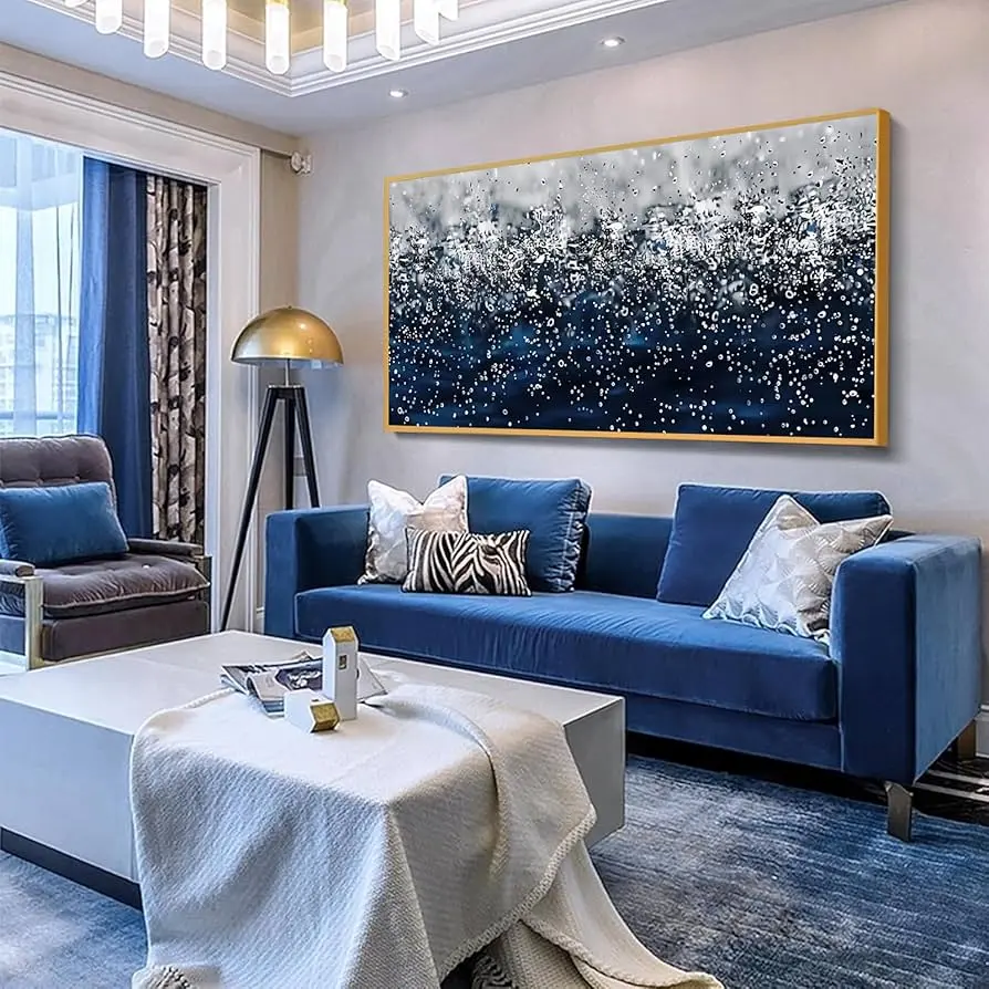
Idea #3: Navy Blue and Silver

For a cooler take on Art Deco, pair deep navy with sleek silver. This combination is dramatic yet serene, making it a smart choice for bedrooms or dining areas. Think navy walls, silver-framed mirrors, and geometric patterned rugs.
This palette also works well for digital design, especially if you’re aiming for something elegant but not overly bold. Add crystal chandeliers or mirrored furniture to play up the silver details.
Idea #4: Blush Pink and Champagne Gold

If you want a softer, romantic twist on Art Deco, blush and champagne gold are perfect. The delicate pink keeps things airy, while champagne tones add glamour without feeling too heavy.
This palette is ideal for weddings, feminine workspaces, or chic bedroom designs. Pair it with velvet upholstery, vintage lighting, and metallic art prints for a Pinterest-perfect look.
Idea #5: Teal and Copper

Teal offers a rich jewel tone with lots of depth, and when paired with copper accents, it feels both modern and vintage. Imagine teal wall paint with copper pendant lights, or teal dining chairs with copper tableware.
This palette shines in kitchens and dining rooms, where warmth and sophistication meet. It’s also fantastic for graphic design projects when you want to stand out from the typical black-and-gold Art Deco trend.
Idea #6: Burgundy and Antique Gold

Burgundy is a classic color of opulence, and when paired with antique gold, it creates a palette that feels rich and timeless. Use it for dramatic living room walls, velvet drapes, or accent pillows.
This color pairing is particularly perfect for autumn and winter styling, where deeper tones feel cozy and luxurious. If you’re styling a wedding, this palette works beautifully for florals, table linens, and candlelight.
Idea #7: Black, White, and Chrome

Minimalists can still embrace Art Deco with a sleek black, white, and chrome palette. This high-contrast look works well for modern spaces, especially bathrooms and kitchens with glossy finishes.
The chrome accents keep the palette from feeling flat, while black and white geometric patterns nod to classic Deco motifs. Add statement lighting and marble textures for maximum impact.
Idea #8: Mustard Yellow and Charcoal

For a bold, unexpected twist, mustard yellow paired with charcoal gray brings a retro edge to Art Deco styling. Mustard tones recall the vibrancy of the Jazz Age, while charcoal keeps it grounded.
This palette is ideal for upholstery, patterned wallpaper, or even fashion styling like coats and accessories. If you’re afraid of too much yellow, use it as an accent against charcoal-heavy backdrops.
Idea #9: Royal Purple and Silver

Purple has long symbolized luxury, and when paired with silver, it feels both regal and glamorous. This combination works beautifully in bedrooms or lounges, especially with velvet fabrics and mirrored furniture.
For a seasonal touch, this palette also works well in winter and holiday décor. Add crystal chandeliers or glass details to make the silver shine even brighter.
Idea #10: Coral and Gold Leaf

Coral brings a bright, joyful energy to the Art Deco palette, and when combined with gold leaf, it feels lively and elegant. This is a fun palette for creative spaces, like home offices or studios.
In events, coral florals paired with golden table settings create a stunning display. It’s particularly great for spring and summer styling when brighter tones feel seasonal and fresh.
Idea #11: Sage Green and Bronze

Sage green is a trending color that pairs beautifully with the warm glow of bronze. Together, they create a calming yet sophisticated palette that works well in kitchens, bathrooms, and even outdoor patio setups.
If you want to keep your Art Deco look subtle and modern, this is a fantastic choice. Pair with textured wallpaper or terrazzo surfaces for added depth.
Idea #12: Midnight Blue and Champagne

This pairing feels dreamy and refined, perfect for luxurious bedrooms or upscale dining rooms. Midnight blue walls instantly feel dramatic, while champagne accents bring in just the right amount of shimmer.
To complete the look, add plush fabrics like velvet and satin, plus geometric metallic art pieces. For events, this palette makes an elegant evening wedding theme.
Idea #13: Turquoise and Gold

Turquoise adds a burst of vibrancy that feels distinctly vintage. When matched with gold, it becomes playful yet elegant—a perfect nod to the exuberance of the 1920s.
Use this palette in smaller doses if you don’t want a full turquoise room. Think accent pillows, decorative glassware, or vintage posters. This pairing also shines in graphic design projects for social media.
Quick Styling Tips for Art Deco Palettes
- Always balance bold colors with metallic accents to keep the Art Deco look authentic.
- Use geometric patterns, like chevrons or fan motifs, to highlight the palette.
- Velvet, marble, and lacquered finishes enhance the luxury feel.
- Don’t be afraid to mix jewel tones together—Art Deco thrives on richness.
Conclusion
These 13 stunning Art Deco color palettes prove that glamour never goes out of style. Whether you love bold jewel tones, soft pastels, or timeless black and gold, there’s a palette here to inspire your next project.
Which palette was your favorite? Let me know in the comments below! And don’t forget to save this list on Pinterest so you can return to it when you’re ready to style your home, wedding, or creative work.
If you’re planning a full seasonal refresh, you’ll also love exploring our guides on vintage-inspired interiors and cozy porch makeovers.


